Why is it important to communicate data effectively?
This post aims to explore the art of storytelling with data and why it is crucial to communicate data effectively.
In this post, you will find:
- Brief introduction and challenges of storytelling with data,
- What is Storytelling?,
- Storytelling with Data,
- 5 tips for Storytelling with Data,
- Some tools, and
- Conclusions
Having just finished reading ‘Storytelling with Data by Cole Nussbaumer Knaflic,’ I’d like to share a few key takeaways and highlights from the book. However, to delve into the complete and detailed content, I strongly recommend reading the entire book for a more comprehensive understanding.
Introduction
The challenges in data communication can vary according to the sector or area; however, some of the most common ones include:
- Communication gap between data scientists/researchers and audiences with little or no technical knowledge.
- Limited time and attention or a finite amount of mental processing power.
So, how can you bridge the gap between researchers and non-technical audiences?
The answer is storytelling — sharing information in the form of stories, and communicating data through a compelling narrative is more likely to resonate with your audience and be memorable.
What is Storytelling?
In a word, it’s a narrative.
Storytelling is about communicating the meaning of a dataset with visuals and a narrative tailored to each specific audience.
Because it’s important?

- Demonstrate the value of data and advocate its role in your business.
- Combine the technical, analytical, and precise nature of data with structure and narrative.
- Convey the most important results of an analysis in a story that is concise and succinct.
Storytelling with Data
Storytelling with data by Cole Nussbaumer Knaflic.
Essential reading for anyone working in the field of data.
The main highlight of this book is its simplicity: the author employs straightforward language across various chapters, making it exceptionally easy to comprehend and follow.
The author provides highly detailed instructions and tips on presenting ideas, structuring a story, and employing specific “tricks” to reinforce the main message.
Within this book, you will encounter the fundamental concepts, extensively explained and covered.
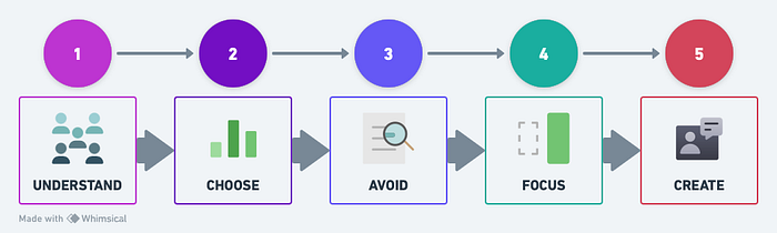
5 tips for Storytelling with Data
- Understand the context.
- Choose an effective visual.
- Avoid information overload.
- Focus attention strategically.
- Create a compelling narrative.
1. Understand the context.
Before you begin creating a report or presentation, it’s essential to understand:
- Who is my audience?
- What do I want my audience to know or do?
- How do we intend to communicate using the data?
- The appropriate tone, language, and tense to be used.
Once we have a much clearer understanding of what, who, and how we want to communicate, we can start creating the report or presentation.
2. Choose an effective visual.
Prepare and experiment with various types of charts to determine the best one in terms of clarity and organization.
- Simple numbers
- Tables and heat maps
- Scatter, line, and bar charts
Avoid 3D graphics, pie charts, and secondary axes.
3. Avoid information overload.
Create a well-organized structure that is easy to read and free from distracting and uninformative elements.
Recognize patterns and relationships between elements:
- Similarity
- Continuity
- Closure
- Proximity
- Figure/Ground
- Symmetry and Order

4. Focus attention strategically.
Learn how to capture the attention of your audience effectively.
- Establish a “visual hierarchy.”
- Ensure that graphics, data, and text create a well-organized structure.
- Use alignments, colors, and shapes intelligently
- Direction
- Shape
- Size
- Color Tone
- Intensity
- Position

5. Create a compelling narrative.
Crafting a narrative can be defined in various ways, depending on how you choose to initiate it:
- Introduction — Development — Conclusion
- Chronological Sequence
- Sequential Presentation of Results
Some tools
DATA VISUALIZATION
- Matplotlit – Visualization with Python
- Seaborn – Statistical data visualization
- Plotly – Low-code data app development
- Vega-Altair – Declarative visualization in Python
- Bokeh – Interactive data visualization
TYPES OF GRAPHICS
- From Data to Viz – Find the graphic you need
Conclusions
- Effective data storytelling can significantly influence how companies make decisions.
- Storytelling provides a method to communicate the most crucial analysis results in a concise and succinct narrative.
- A compelling read (essential) for data scientists due to its simplicity: exceptionally easy to read and follow.
References
made with 💙 by mafda.